Beauty Fades
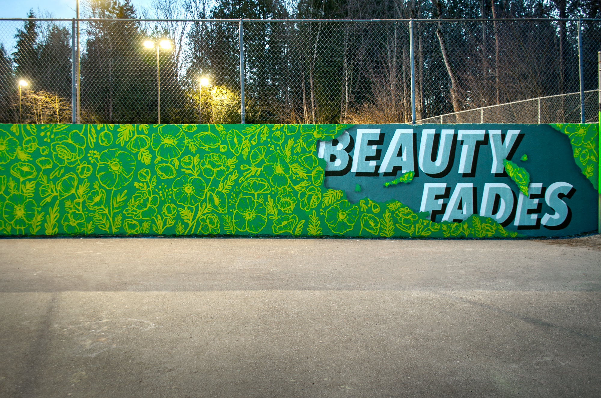
Beauty Fades
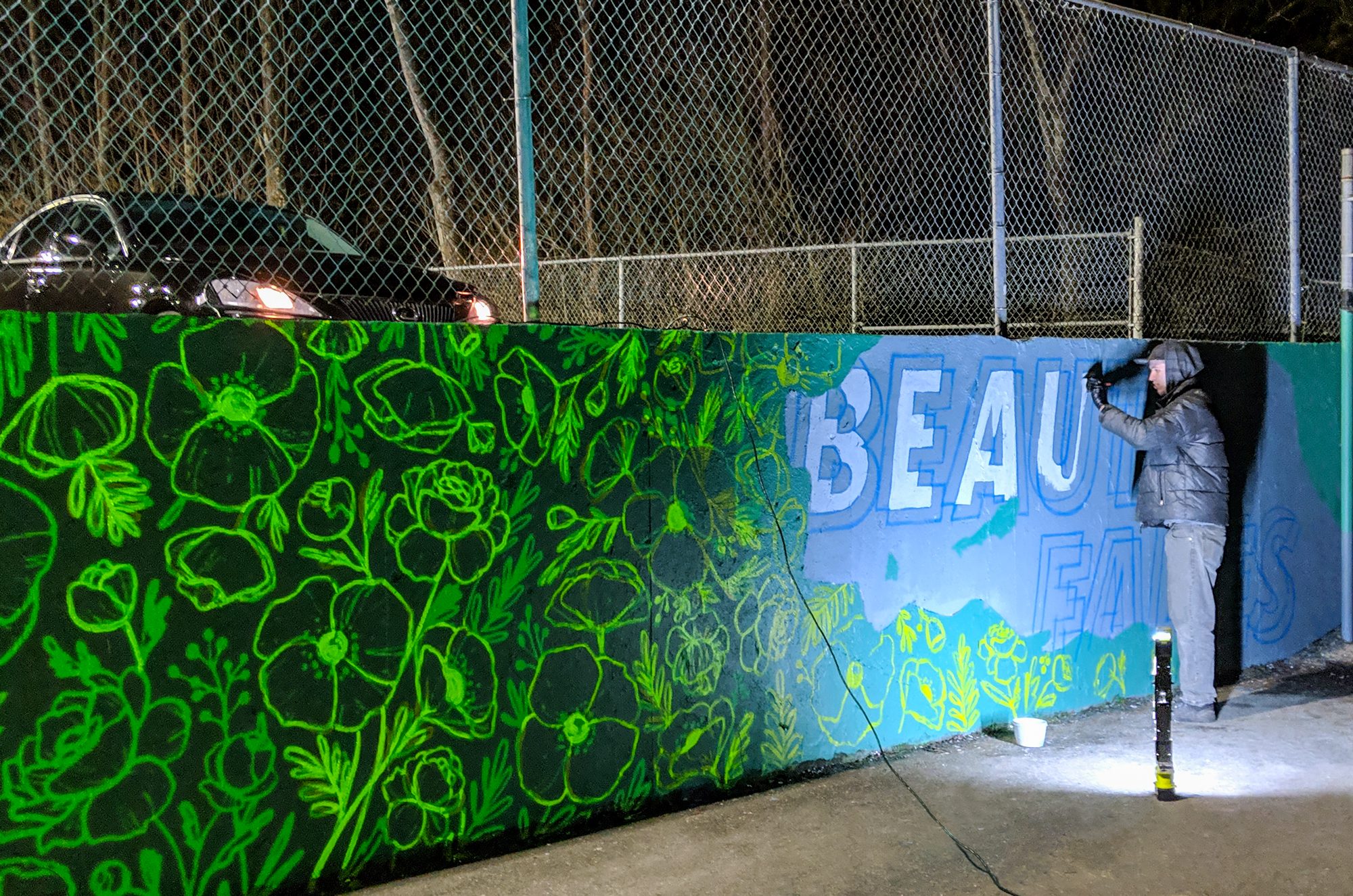
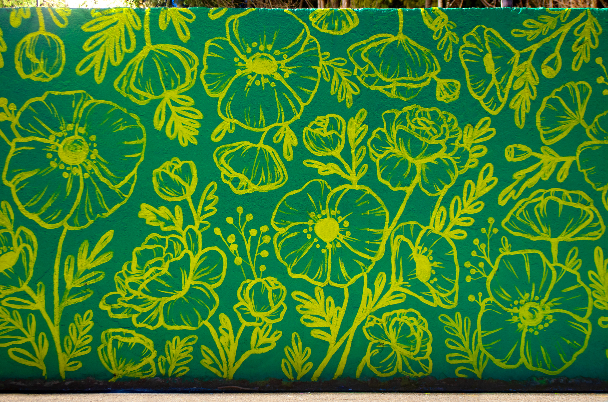
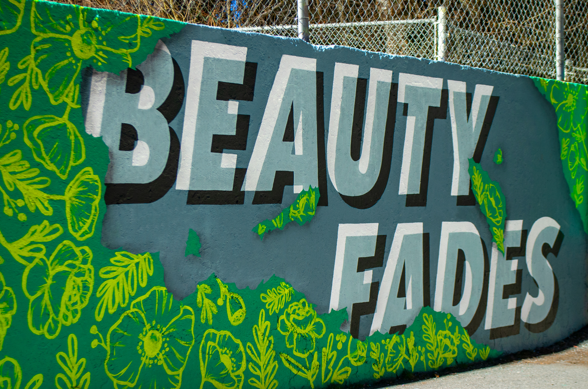
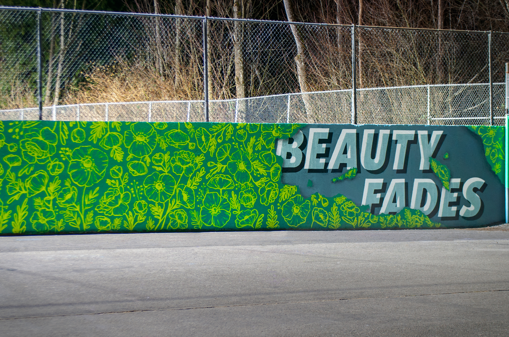
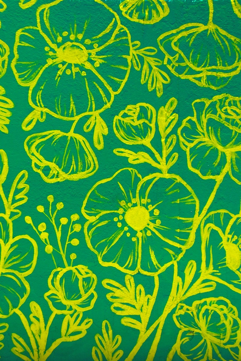
This installation was a collaborative effort between Jocelyn Wong and myself. We really wanted to highlight how our styles contrast each other and come together to create a piece that is both punchy and bold, but with a strong illustrative aspect. We executed this by utilizing heavy, attention grabbing type with a muted palette and combined it with a meticulously arranged floral pattern. Visual interest was created for the type with a subtle light to dark gradient background, as well as transparency and shadow. Interest for the floral pattern was created using careful arrangement, as well as colours that are bold but also nature inspired.
The concept was built around highlighting the importance of inner qualities. This is at a middle school and we wanted a message that fosters valuing an individual’s inner traits, especially considering how impressionable and confidence lacking our main audience can be at times. The floral pattern looks as if it’s being torn through, exposing the important messaging underneath. While the wrapping is nice to look at, it doesn’t last forever and the elements underneath are just as valuable.
